Performance Diagnostics
You can use the Performance Diagnostic dashboard to analyze the database performance for Advanced Server instances by monitoring the wait events. To display the diagnostic charts, PEM uses the data collected by Advanced Server’s EDB Wait States module.
For more information about EDB Wait States, see the EDB Postgres Advanced Server Guide, available at:
You can analyze the Wait States data on multiple levels by narrowing down your selection of data. Each level of the chart is populated on the basis of your selection of data at the higher level.
Prerequisites
You must have superuser privileges to access the Performance Diagnostic dashboard.
You must ensure that the EDB Wait States module is installed. Modify the
postgresql.conffile, adding theedb_wait_stateslibrary to the list of libraries in theshared_preload_librariesparameter:shared_preload_libraries = '$libdir/edb_wait_states'Then, restart the database server, and create the extension:
CREATE EXTENSION edb_wait_states;The console will display an error if you do not meet the prerequisites.
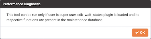
The prerequisites error
To open the Performance Diagnostic dashboard, select the Performance
Diagnostic option from the Management menu of the PEM client.
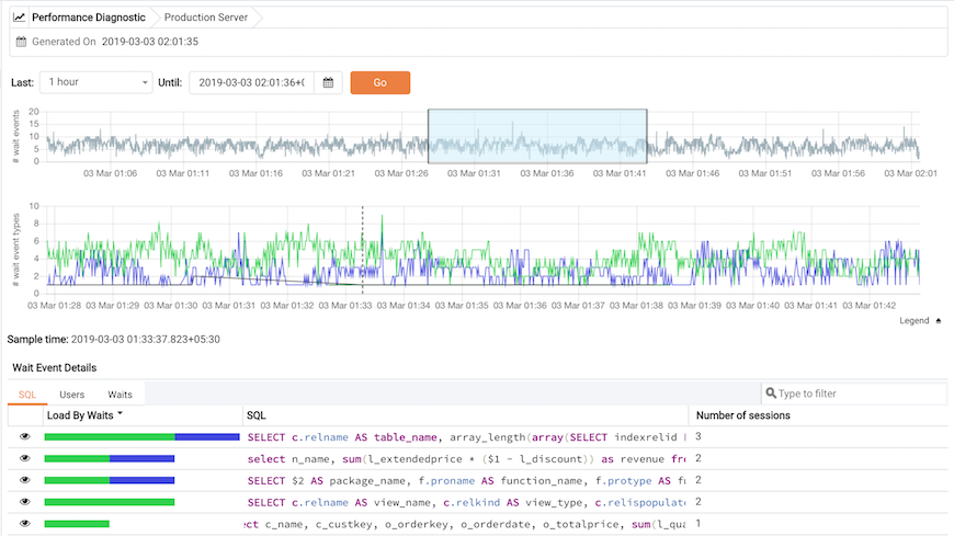
By default, the top most Performance Diagnostic chart
pulls the data for one hour, starting from current date and time. The
default range selection in hours in the first chart can be customized in
the Performance Diagnostic section of the Preferences dialog under the
File menu. You can also use the Preferences dialog to display
Performance Diagnostic in a new browser tab. Use Open in New Browser
Tab? to display the Performance Diagnostics dashboard in a new browser
tab.
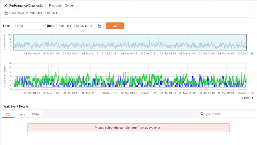
The Performance Diagnostics chart
Use the Last drop-down list box to select the duration for which you
want to see the chart. Select the 1 hour, 4 hours, 12 hours, or 24
hours. You can also select the date and time through which you want the
data to be displayed.
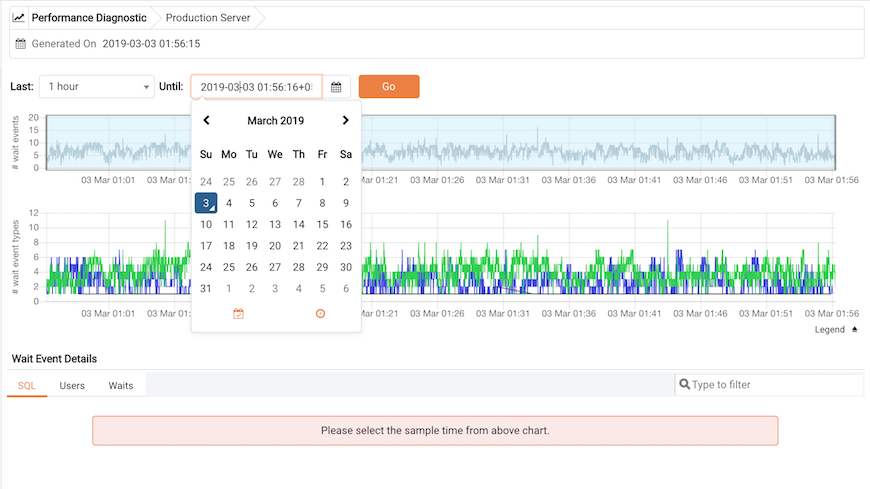
Selecting a date
The first chart displays the number of wait events that have occurred over the period of time that is selected for the charts. You can narrow down the timeline in the first chart to analyze the data for a specific period. The second chart displays the total number of wait events of each type, for the timeline that you select in the first chart. You can select the specific wait event types for which you want to analyze the data.
To make differentiation easier, the graph for each wait event type is
displayed in a different color. Click on Legend to identify the color in
which a particular wait event type is displayed in the graph.
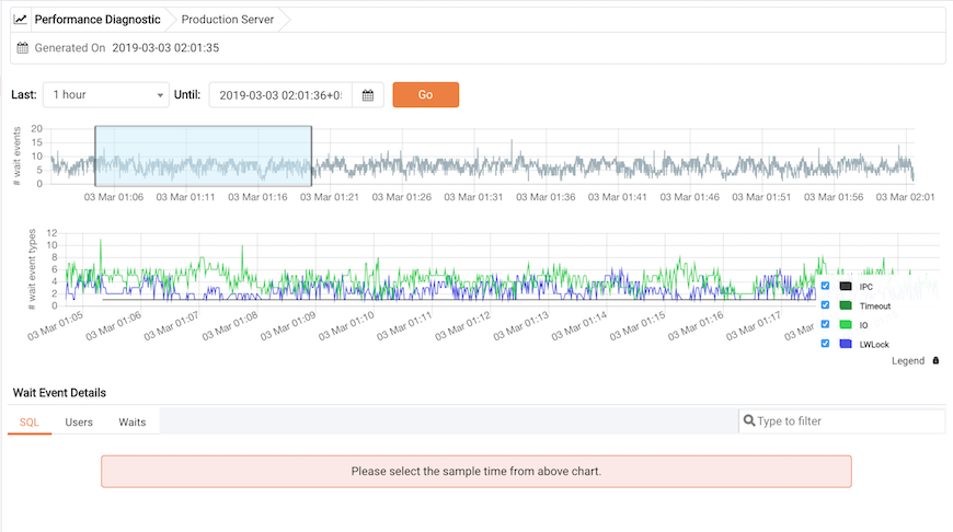
Selecting a timeline
Select a point in time on the second chart for which you wish to analyze
the wait events; the Wait Event Details panel is populated on the basis
of your selection in the second chart. The panel makes wait details
available on three tabs:
The
SQL tabdisplays the list of SQL queries having wait events for the selected sample time.The
Userstab displays the details of the wait events grouped by users for selected sample time.The
Waitstab displays the number of wait events belonging to each wait event type for the selected sample time.
You can filter the data displayed on the three tabs, or sort the data alphabetically by clicking on a column header.
Reviewing query details
Click on the Eye icon in any row to display a new tab with details of
the query for a particular row. This tab displays the Query ID and its
corresponding sessions IDs in a dropdown list. Select the session ID for
the query for which you want to analyze the data; the tab will display
details corresponding to the selected session ID and query ID.
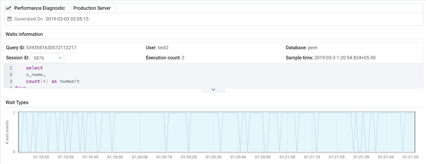
The Waits information table displays the waiting query. If
the query is partially displayed, click the down arrow at the
bottom of the section to view the complete SQL query.
The Waits information panel
The Wait Types panel displays the total number of wait
events for the selected session ID and query ID. Select a time range in
the first chart to analyze the data for a specific period.
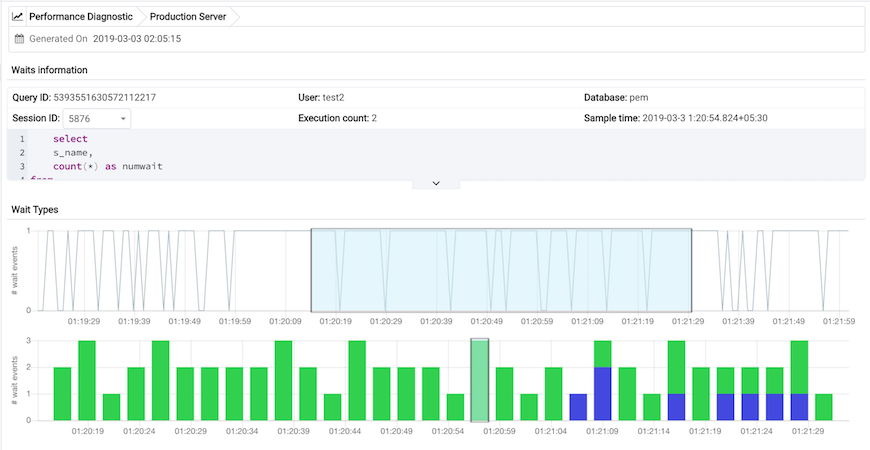
The Wait Types bar graph displays the total number of wait event types
for the duration that you select. To make differentiation easier, each
wait event type is represented by a different color in the bar graph.
The wait types bar graph
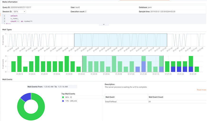
Select the range for which you want to analyze the wait event types and
their corresponding wait events; the Wait Events donut chart is
populated on the basis of your selection. In the Wait Events donut
chart, all the wait event types applicable to the selected duration are
displayed in the percentage format. You can select any one wait event
type to see all the wait events belonging to that particular wait event
type and their count. Click Read More to read about the various wait
event types and wait events.
The wait events donut chart
In the Wait Events donut chart, all the wait event
types applicable to the selected timeline are displayed a percentage
format. You can select any one wait event type to see all the wait
events belonging to that particular wait event type and their count.
Click the Read More link to read about the various wait event types and
wait events.